Erik asked me to write a blog post while he’s out having fun on vacation.
He said I could write about whatever I like. After starting to write a great post about chupacabras, I remembered that this was suppose to be an art focused blog.
So instead of the chupacabra post, I’ll write about something we were discussing in the office the other day. I opened up a box that had just been shipped to me by a freelancer. Inside was a painting that was to be used in a trading card game so I was a bit surprised to see a blue skinned creature on a blue background. It was really difficult to read when I printed it out at a small size. The problem was that there was note enough contrast.
While I love good composition, anatomy, brushstrokes and color harmony as much as the next guy you cannot forget about contrast when creating images that will be reduced down to the size of a stamp or a trading card. Remember that a strong silhouette is your friend. Define a great shape, make sure you don't loose it and you're half way done.
Here are a couple ideas to keep in mind the next time you want contrast in your illustration:
1) Use a dark figure on a light background.
2) Use a light figure on a dark background.
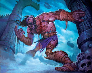
3) Use a warm figure on a cool background.
4) Use a cool figure on a warm background.
5) Use a complicated figure design against a simple background.
Here is an example of a warm figure against a cool background by the man himself Erik Gist.
Here is an example of a cool figure against a warm background by Efrem Palacios.
Here is an example of a dark figure against a light background by Michael Komarck.
Here is an example of a light figure on a dark background by Matt Cavotta.
Here is an example of a complicated figure against a simple background by Jesper Ejsing.
If you haven’t seen them, Drew Struzan’s Star Wars stamps are also a great example of an illustrations with strong contrast: http://www.freewebs.com/cebustarwarsclub/stamps.htm
I know it sounds obvious but you’d be surprised and how many artist I see though out the year putting blue figures on blue backgrounds or dark figures on dark backgrounds.
Have fun and keep painting!
All images (c) 2010 Blizzard Entertainment


2 comments:
Wha! thanx for the gem!
is it possible to get in contact with Jeremy Cranford - i am looking for a graphic designer for a webpage!
Dirk
dirkb@fedcon.de
Post a Comment