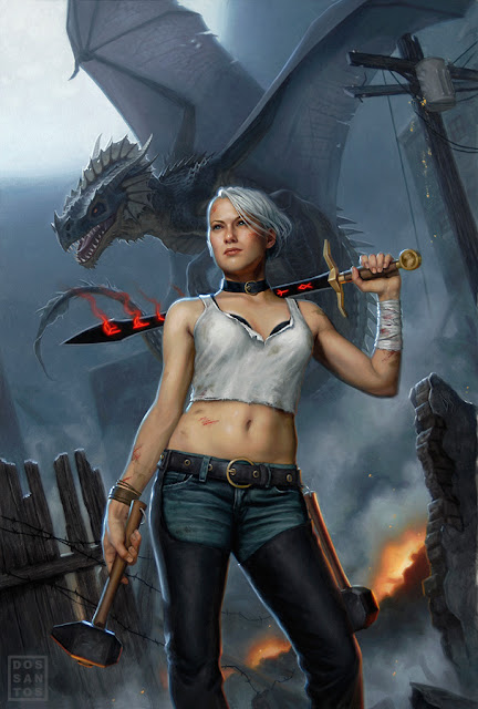
I usually do my sketches in Photoshop. At this point, I do not use any reference. I am merely trying to convey a concept, and am not overly concerned about anatomical accuracy or realism. If the AD can tell what's going on, it'll suffice. Of course, it doesn't hurt to polish up those sketches that you really want them to pick.
I typically do anywhere from 2 to 4 sketches for a job. In most of these, I kept exploring the idea of these glowing runes that have mysteriously appeared on the heroine's face and sword. The Art Director and I both had favorites, and deliberated over the phone as to which would be the most appropriate for the cover. Eventually we concluded that even though we felt some sketches had stronger compositions, it was sketch #3 that would sell the story best. Which brings us to Fantasy Marketing Rule #1: If there be dragons in the story, there better be dragons on the cover. Unfortunately, both the AD and I felt that having the Heroine's back turned toward the viewer gave the dragon more importance, and took away from the character driven aspects of the story. The AD requested that I do another sketch, similar to #3, but this time depicting the woman facing the viewer. I quickly got back to work, producing another sketch composed of bits and pieces of unused sketches and paintings from old jobs. The result is a bit 'frankenstein-ish' (as well as derivative), but it meant I could do the sketch VERY quickly, and email it to the AD before the work day ended. Slapdash or not, it got the idea across, and I got sketch approval before the weekend, giving me substantially more time for the final art.
 Once I have sketch approval, I then book a model and proceed to shoot all the reference I will need for the painting. Having the approved sketch as a guide, I can shoot very efficiently, since I do not have to shoot a whole lot of alternate concepts. Rather, I focus on the pose, lighting and little details like the subtleties of her hands and facial expression. For things like dragons, where live models are not an option, I often times build crude models out of a piece of Sculpey, or even my kneaded eraser, so that I can get a rough approximation of the lighting.
Once I have all my reference, I recompose my sketch in Photoshop and begin to draw in all the elements that are missing or no longer work because of a perspective or lighting shift. When I am happy with the results, I print out my new comp and begin graphing out the final painting.
 I do my final drawing directly on my gessoed illustration board. Unfortunately, this means that I have no original drawing left preserved. On the upside, I can get a very fine level of detail that will help me immensely when I paint the image. By doing a rather refined drawing, I can apply the oil paint very thinly, permitting the pencil to show through and do a lot of the work for me. This is particularly helpful when painting things like wood grain and denim jeans. Just a little glaze of color, and it looks completely done. Things like the face also start out very thin, as to preserve the drawing for as long as possible, but eventually become opaque as I grow confident in it's accuracy.


Once completed, about ten days later, I have the painting scanned and submit it to the client. In this case, the AD didn't feel the dragon looked mean enough, so I had to alter it's head a little in Photoshop. I gave it horns, added some decay, and altered it's facial structure a bit to make it look less dinosaur-like. I later decided I liked it better that way too, and decided to revise the original painting to match.
For more information on my oil painting process, as well as a hi-resolution wallpaper featuring this art, check out my website HERE.


1 comment:
great result my friend:D thanks for sharing:)
Post a Comment