Thursday, September 30, 2010

Inside the Artist's Studio: Quick Sketch part 1

Let me start by thanking Dan and Jeremy. Great job guys, I owe you both a drink or six at IlluXCon.
I meant this post for yesterday, but I ended up getting sick over the course of our entire trip. So, while I am feeling better I was exhausted when we got home.

Anyway, I have never done a thorough dissection of quick sketch in handout form. So in honor of this semesters qs class filling up so quickly I am going to do that over the next few weeks. I am starting with a reconstruction of a handout that was initially given to me some 15 years ago by Jeff Watts, and then later by Glen Orbik. Both of the copies given to me are in pretty poor shape so I have recreated it with a few changes in terminology, and using samples of my own drawings.

Starting tomorrow I will be essentially breaking this handout down in to more in-depth explanations. Look it over, and if you have any questions post them in the comments, and I will do my best to answer them in the upcoming posts.

Click the image to download a PDF


Monday, September 27, 2010

Guest Blogger : Jeremy Cranford


Erik asked me to write a blog post while he’s out having fun on vacation.


He said I could write about whatever I like. After starting to write a great post about chupacabras, I remembered that this was suppose to be an art focused blog.


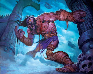
So instead of the chupacabra post, I’ll write about something we were discussing in the office the other day. I opened up a box that had just been shipped to me by a  freelancer. Inside was a painting that was to be used in a trading card game so I was a bit surprised to see a blue skinned creature on a blue background. It was really difficult to read when I printed it out at a small size. The problem was that there was note enough contrast.


While I love good composition, anatomy, brushstrokes and color harmony as much as the next guy you cannot forget about contrast when creating images that will be reduced down to the size of a stamp or a trading card. Remember that a strong silhouette is your friend. Define a great shape, make sure you don't loose it and you're half way done.


Here are a couple ideas to keep in mind the next time you want contrast in your illustration:

1)      Use a dark figure on a light background.

2)      Use a light figure on a dark background.

3)      Use a warm figure on a cool background.

4)      Use a cool figure on a warm background.

5)      Use a complicated figure design against a simple background.


Here is an example of a warm figure against a cool background by the man himself Erik Gist.


Here is an example of a cool figure against a warm background by Efrem Palacios.


Here is an example of a dark figure against a light background by Michael Komarck.


Here is an example of a light figure on a dark background by Matt Cavotta.


Here is an example of a complicated figure against a simple background by Jesper Ejsing.


If you haven’t seen them, Drew Struzan’s Star Wars stamps are also a great example of an illustrations with strong contrast: http://www.freewebs.com/cebustarwarsclub/stamps.htm


I know it sounds obvious but you’d be surprised and how many artist I see though out the year putting blue figures on blue backgrounds or dark figures on dark backgrounds. 

Have fun and keep painting!


All images (c)  2010 Blizzard Entertainment

Friday, September 24, 2010

Guest Blogger : DAN DOS SANTOS

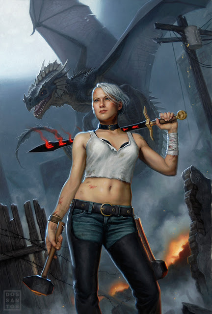
About a year ago, I was asked to do the cover for a novel called 'Black Blade Blues'. As usual, I asked the Art Director to send me the manuscript so that I can get some insight as to what the book is about. Upon reading it, I was really excited to discover that not only was the story well written, but that the subject matter could not be cooler. Here was a story about a rugged, female Blacksmith, with a white mohawk, who dons a black sword as she slays dragons in modern day Seattle! Very cool. Pleased as could be, I went about doing sketches.

I usually do my sketches in Photoshop. At this point, I do not use any reference. I am merely trying to convey a concept, and am not overly concerned about anatomical accuracy or realism. If the AD can tell what's going on, it'll suffice. Of course, it doesn't hurt to polish up those sketches that you really want them to pick.

I typically do anywhere from 2 to 4 sketches for a job.  In most of these, I kept exploring the idea of these glowing runes that have mysteriously appeared on the heroine's face and sword. The Art Director and I both had favorites, and deliberated over the phone as to which would be the most appropriate for the cover. Eventually we concluded that even though we felt some sketches had stronger compositions, it was sketch #3 that would sell the story best. Which brings us to Fantasy Marketing Rule #1: If there be dragons in the story, there better be dragons on the cover. Unfortunately, both the AD and I felt that having the Heroine's back turned toward the viewer gave the dragon more importance, and took away from the character driven aspects of the story. The AD requested that I do another sketch, similar to #3, but this time depicting the woman facing the viewer. I quickly got back to work, producing another sketch composed of bits and pieces of unused sketches and paintings from old jobs. The result is a bit 'frankenstein-ish' (as well as derivative), but it meant I could do the sketch VERY quickly, and email it to the AD before the work day ended. Slapdash or not, it got the idea across, and I got sketch approval before the weekend, giving me substantially more time for the final art.


Once I have sketch approval, I then book a model and proceed to shoot all the reference I will need for the painting. Having the approved sketch as a guide, I can shoot very efficiently, since I do not have to shoot a whole lot of alternate concepts. Rather, I focus on the pose, lighting and little details like the subtleties of her hands and facial expression. For things like dragons, where live models are not an option, I often times build crude models out of a piece of Sculpey, or even my kneaded eraser, so that I can get a rough approximation of the lighting.

Once I have all my reference, I recompose my sketch in Photoshop and begin to draw in all the elements that are missing or no longer work because of a perspective or lighting shift. When I am happy with the results, I print out my new comp and begin graphing out the final painting.

I do my final drawing directly on my gessoed illustration board. Unfortunately, this means that I have no original drawing left preserved. On the upside, I can get a very fine level of detail that will help me immensely when I paint the image. By doing a rather refined drawing, I can apply the oil paint very thinly, permitting the pencil to show through and do a lot of the work for me. This is particularly helpful when painting things like wood grain and denim jeans. Just a little glaze of color, and it looks completely done. Things like the face also start out very thin, as to preserve the drawing for as long as possible, but eventually become opaque as I grow confident in it's accuracy.


Once completed, about ten days later, I have the painting scanned and submit it to the client. In this case, the AD didn't feel the dragon looked mean enough, so I had to alter it's head a little in Photoshop. I gave it horns, added some decay, and altered it's facial structure a bit to make it look less dinosaur-like. I later decided I liked it better that way too, and decided to revise the original painting to match.


For more information on my oil painting process, as well as a hi-resolution wallpaper featuring this art, check out my website HERE.

Wednesday, September 22, 2010

Cobweb Detective Club

Edit: Okay so I am sitting here in the airport and I got to thinking "I wonder if my blogpost helped get the word out for CDC?" To help me out, let me hear from you. You don't have to post your name, but leave a comment on this post if you bought Dug's graphic novel, and if you want to, leave a little review. If you really liked it post a link on your Facebook, blog, Twitter, whatever.

One last thing before I take off for a few days. My buddy Dug Nation completed a real labor of love earlier this year. As an artist I have known a lot of guys (myself included) who have talked about doing their own graphic novel, but very few have ever followed through. Dug not only followed through, but produced a top notch 75 page festival of cool.

Granted as someone who is not only good friends with the creator of this book, but also a great lover of all things pulp and horror, I sit smack dab in the heart of this books target demographic. This is why I have remained fairly quiet about this project, but it has gone criminally neglected long enough. For only a $1.99 you owe it to yourself to check out this amazing book. Check out a preview here. Then go over and buy it here.


Materials: Gouache Sketching

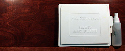
I am about to leave on a trip to Charleston, SC. As I will be doing some sketching out there I thought I would use this as an opportunity to go over the materials I use to sketch in color. I have a Masterson's Stay-wet Handy Palette, that doubles as my carrying kit for my materials.


In this I have a very limited palette of Winsor & Newton gouache colors, permanent white, lemon yellow, golden yellow, flame red, ultramarine blue, ivory black. For brushes I have a limited assortment of synthetic sable rounds and one .25 inch flat. For the sketchbook I have a random 5 x 7 spiral bound with heavy, lightly toned paper. I don't remember where I got this thing, so I will be very sad when it is full because it is great for water based media. I also have a spray bottle, because it is compact and multi-purpose. To lay-in my drawing I use a mechanical pencil with a hb lead


Just for fun here is a landscape gouache I did from reference, probably 10 years ago.


As I mentioned I am heading out of town for the next five days or so. I am honored to have two guest bloggers, and they are Dan Dos Santos. Dan will be filling in on Friday, if you don't know Dan's work, shame on you and click on his name. On Monday will be Jeremy Cranford Sr. Art Manager at Blizzard. Thanks Dan and Jeremy.


Monday, September 20, 2010

Life Drawing Studies and Demos (Sept 2010)

Edit: I forgot to mention, I have had some people over the last year or so express an interest in buying some of my life studies. I have started up an Etsy shop for just this purpose, so go and check it out. It is a little sparse right now, but as I catalog the better drawings that are still in good shape I will list them. Quicker studies will list at about $3o and longer studies at about $50.

30 min +/-

1.5 hrs +/-

40 min +/-

25 min

5min

4 hrs +/-

Friday, September 17, 2010

James Gurney Workshop

As many of you may know I teach at Watts Atelier. On behalf of The Atelier I am pleased to announce that James Gurney, creator of Dinotopia, is doing a workshop/demonstration on October 15th 2010. This is what Mr. Gurney has to say about the workshop on his blog


"October 15, Encinitas (near Carlsbad) California

Come join me for a special half-day workshop at the Watts Atelier,founded by academic master Jeff Watts. I’ll be offering an information-packed afternoon with two lectures and demos, and lots of discussion and Q and A.


Lectures include:
“Plein-Air Pioneers.” History and modern practice of plein air painting and sketching, with detailed illustrations of my oil, watercolor, and oil set-ups.


“Color and Light.”An hour-long illustrated talk covering the key concepts most useful for realistic painting. I'll have an advance copy of the new book, but sales copies may not be available quite yet.

Plus, a portrait demo using water-soluble colored pencil sketching and water brush technique.

The fee is $45.00. Space is limited and quickly filling, so be sure to sign up soon. Watts Atelier can be reached at (760) 753-5378."

For anyone who can make it, I can't recommend this enough. Plus I will be there, and it would be great to meet any of you that I have not met before, and to see any of you I have not seen in awhile.

Thursday, September 16, 2010

Inspiration: Mike Hill

I have done some sculpture, but I am not a sculptor. I love the work of many of my contemporaries, but I am more often inspired by those who have come before. So this months inspiration will probably seem out of place, but what is more inspiring than something that gives you a greater appreciation for something outside of your comfort zone? All that being said, Mike Hill's monsters do kick unholy ass.

Keep in mind, these are all sculptures, with the exception of the fellow standing in between Lon Chaney Jr. and his alter ego below. That is Mr. Hill himself. You can see more of his work on his outdated webpage Mike Hill Artworks


Biography

Michael E. Hill was born in Cheshire, England. From an early age he developed a passion for the fantastic whether it be comic books, television or movies. Escapism wasn't a word he knew then, but he dreamed of a fantastic world filled with masked vigilantes, men who transformed into wolves and Islands ruled by giant apes. From the age of four Mikes artistic ability started to shine and he began to draw the fantastic images he adored.


Mike's one unique trait was to question how and why these characters looked and behaved the way they do, always over thinking!

"I would ask myself and others crazy questions. What did King Kong do all day, when he’s not fighting dinosaurs and wouldn't he be scarred from head to toe, with all those prehistoric creatures he had to battle? And really puzzling details like, how come we can’t see Spiderman’s web shooters beneath his costume, or his ears…or his underwear? Or stuff that still bugs me to this day, when a werewolf turns back to a man where does all the fur go? Does he lose his teeth fillings? People looked at me as if to say, "Son, you've really got problems"


Mike's passion still remains the same...over thinking the impossible! Through his art, Mike hopes to share with his audience that little boy's dreamland and maybe answer some of his own questions.

Tuesday, September 14, 2010

New Warcraft TCG set: Icecrown

A new Set for the Wow TCG was released today, these are my contributions.


Tor.com Zombie Article

Illustrator Dave Palumbo, recently contacted me about being included in an article for Tor.com about the the influence of zombies in illustration. At the time I thought it would be fun, and now looking at the other people included I am incredibly flattered to be amongst them. Go on over and have a read. http://www.tor.com/blogs/2010/09/favorite-zombie-art-a-gallery.

Illustration by Dave Plaumbo

Monday, September 13, 2010

Interview: Brad Kasten

After posting pictures of my new easel last week I had a lot of people asking me questions about it, and showing interest in purchasing one. I thought the easiest way to handle this was to do an interview with my longtime friend and the designer of the easel Brad Kasten. Brad designs all of the studio equipment for the Sienna Plein Air, Artisan, and Ultra series for Crafttech International. You can purchase them from a variety of retailers including Madison Artshop.


Dead of the Day- When did you first start drawing and painting?

Brad Kasten- I started when I was very young, like most artists I know. I was absolutely obsessed with Star Wars and Legos when I was a kid. Both are probably the reason for being an artist as well as a designer. I would draw and build spaceships, fighter jets, robots, guns, the usual kid stuff.

DotD- What first inspired you create and build your own designs for studio equipment?

BK- I was broke. Early in high school I wanted an easel but I couldn’t afford anything, so I built one. I used scrap wood my Dad had in the workshop, it wasn’t pretty but it worked. In college I shelled out the cash for my first French easel. Five minutes after I had taken it out of the box I was modifying it to fix all the problems I found. After that I decided to just build whatever I needed in the future.

DotD- How does you own background as a painter influence your designs?

BK- I think being a painter is absolutely essential for designing equipment used by painters.
You have to know what painters want and need. Having a painting background gives me the knowledge of the functionality I have to put into all my designs. Knowing what I like as a painter also helps me design new innovations in my pieces. It also helps when you have a lot of very successful artist friends you can bounce ideas off of.

DotD- What was the first piece of studio equipment you built?

BK- The first piece I built was a simple wood easel in high school. After that I built a more complicated painting/drawing desk and taboret for myself. The first piece I built and sold was a wood painting palette.

DotD- Do you have a favorite piece you have designed?

BK- I have a couple. For pure design the Ultra Series Drafting Table is my favorite. I love the combination of straights and curves. I think it’s the most unique drafting table you can find. As far as a functional design I think the new Multimedia desk/easel I built for you is my new favorite. It’s a very versatile all in one unit, the culmination of all my other designs rolled into one.


DotD- Do you have design theory/philosophy that you start with when you start on a new project?

BK- I think every design has to have something new that isn’t available already. If it already exists why bother. What problem can I solve with this design is another vital question. Once I have a basic idea of what I want to accomplish I work on the engineering to make it work properly. I do this with drawings initially but iron out all the bugs with physical prototypes. Once I have the function down I work on refining the design into its finished version. I usually go through three to five prototypes to get it right. By the end I’m surrounded by a pile of mutilated parts laying all over the place. It’s pretty messy business.

DotD- How did you learn to design and build furniture?

BK- My Dad had a woodworking business when I was very young. I was always building things out of scrap wood. I learned to use hand tools and then power tools. By the time I was in high school I had a very good education in woodworking.
As far as design and engineering go I always had a knack for it. It probably goes back to the Lego days. Designing art equipment is actually a lot harder than furniture. A chair or table doesn’t have to move, you just build it and there it is. Painting easels have a lot of moving parts and have to adjust to the user. A lot of my engineering experience came from trial and error.

DotD- How do you approach going beyond form simply following function?

BK- That is an interesting question. Function must always be in the forefront of any working piece of equipment or furniture. If it doesn’t function properly no one cares how beautiful it is. But to me form is absolutely essential in anything you design. I don’t look at my designs as artwork necessarily but I try to make them as pleasing to look at as to work with. It’s always a compromise between functionality and beautiful form. That’s the challenge with any design whether it’s easels or sports cars.

DotD- What are your long term goals?

BK- A few years ago I began working with a company who now manufactures all my designs under their name. It offers me more time to just focus on designing products and not dealing with all the day to day business obligations. In the future I would like to continue to develop new products but also get back to using them as an artist. I have put my painting on hold for a long time; it would be nice to rededicate myself to it.

DotD- To your knowledge, who is the most famous person that owns one of your easels?

BK- James Brolin, Barbra Streisands husband is probably the most famous person. Michael Whelan the fantasy illustrator also purchased my easels. There was also a United States Senator who bought an easel, I remember that the shipping instructions were very complicated and a huge pain in the ass. That’s what happens when you work with the government I guess.


DotD- What is your favorite cartoon?

BK- That is a profound question with a complex answer. I love cartoons and have many favorites. Batman and Batman Beyond, a wide range of anime, and I love every incarnation of Tenchi Muyo. Any cartoon where five hot alien girls shack up with a teenage boy has to be good.
But my all time favorite cartoon is Robotech. I remember racing home to watch it after elementary school. It was by far the most amazing thing I had ever seen and had a profound impact on me. It is probably the main reason I fell in love with art, and aside from Star Wars is why I love Science Fiction and Fantasy so much. I haven’t seen it in years but to this day I can clearly remember almost every episode. That show will always have a special place in my heart.

Friday, September 10, 2010

Palette Layout

There are many ways to lay out a palette, the most important things, in my opinion, are order and consistency. I generally like to have a warm and cool of each primary (red, yellow blue), and at least one of each secondary(orange, violet, green), tempered with a few earth tones(raw umber,yellow ochre, etc.) for convenience. Here is my current palette and how I lay it out.

I like to lay-out my palette from right to left, warm to cool. While the colors may change slightly from painting to painting the lay-out always remains the same, so that I do not have to dedicate part of my thought process to finding colors. Starting on the right (all colors are Winsor & Newton unless otherwise noted) titanium white, cadmium lemon, cad yellow, yellow ochre, cad orange, cad red, permanent magenta, transparent red ochre (Le Franc), raw umber, winsor violet, french ultramarine, cerulean blue, space blue (Le Franc), cobalt turquoise (Grumbacher), sap green (often replaced by viridian if I need a more chromatic green), ivory black. I sometimes lay out a separate worm of titanium white off to the side for pure highlights.

I have the postcards there to help me key my colors (this is a total lie, I am just a geek who really likes Mike Mignola's work)