Friday, December 31, 2010

Happy New Year!


...well eve, but that is when everyone really celebrates anyway. So here you go, this one is a little obscure. Since I have not run a competition lately, the first one to guess the movie wins a signed copy of both the Kolchak: The Night Strangler comic cover A and cover C. Enter by posting a comment with the title of the movie.


and a bonus sketch of zombie DIck Clark
(because once Jeremy Lewis mentioned it I knew it needed to be done)

Thursday, December 30, 2010

Video Tutorial: Avenger Ep V-VI

episode V


episode VI

Wednesday, December 29, 2010

Video Tutorial: Avenger Ep III-IV

Episode III


Episode IV

Monday, December 27, 2010

Video Tutorial: Avenger Ep I-II (Test)

Hey All,
I am planning on doing some drawing and painting video tutorials. So I thought while I am out of town this week it would be a good time to run a test. I did a quick edit of a live online demo I did a while back, and I will be posting this footage this week. The quality is not the best, and there are gaps in the footage, but it is a glimpse into how I paint. So without further ado...

episode I


episode II

Friday, December 24, 2010

Merry Christmas!

and Happy Holidays!

Tuesday, December 21, 2010

Photo Reference: Part 2

For this illustration there wasn't a specific actor,but there was an established look for the character. That look was Peter Caras' and later George Gross' interpretation of Steve Holland, the ubiquitous "action man" template/model for many of the 1960's and 70's pulp cover illustrators. So of course I went to my go to "action hero" and fellow Watts Atelier instructor Jim Hahn. Jim has the square jaw and steely gaze that is requisite for a pulp hero. So I dressed Jim up in a ridiculous costume and had him pose in a variety of heroic poses that fit the
rough thumbnail I had decided on.


Once I had the reference I liked, I then proceeded to the sketch phase where I turned Jim into Richard "The Avenger" Benson. This actually wasn't that hard because he already bears a passing resemblance to Steve Holland.


First I wanted to give him more heroic proportions so I broadened and rotated the shoulders more towards the camera, I shrunk the head, narrowed the waist, and enlarged the hands. Next I went to work on the head, here I squared off his jaw a little more, added the chin dimple, and gave the eye a bit more of a blank stare (as befits the character), I also thinned his lips some and sharpened his cheek bones.

One last think I modified was the left hand. I rotated it some and spread the fingers to get a stronger silhouette.

Monday, December 20, 2010

Photo Reference: Part 1

I have many different ways of working from thumbnail, to sketch, to final. In this instance I had the added challenge of getting a likeness of a character linked to a specific real person. So I gathered reference after the thumbnail (which I do not always do). When I got this job I was very excited because I am a fan of the Kolchak tv series and Darren McGavin. However, I knew this was going to be a challenge because both the A.D. and I wanted it to look like Mr. McGavin. So after coming up with a thumbnail I liked, I went and got the DVDs of the
first two Kolchak TV movies (much nicer
looking and cinematic than the later series)
and combed it for shots that would fit my thumbnail. I couldn't find the exact shot I wanted, but I found two that when pieced together would work. The next step was to shoot myself in a similar pose to Kolchak because I wanted more information to work with than the screen shots gave me. I also searched the internet for the camera that he used, I never found the exact one, but I did find a similar model.

I have now put together the reference I need, next the trick was to get what I needed out of the ref. I started with a rough lay-in from the screen grabs. Then, using the photos of myself and my own sense of idealization I began to redesign and render. I wanted to push a bit more of a tough rugged Clint Eastwood, or Tommy Lee Jones look, so I added a bit more structure to the face (especially the nose and chin) and squared off the jaw a little more. I also wanted more of a stern look to his squint, so I furrowed the brow and deepened the creases. I used the ref of me quite a bit in the hands, and tilted the shoulders to give a sense of movement. The challenge was to do all of this while maintaining the likeness.

After finishing up, I then paint the final illustration primarily from the final sketch. I only refer back to the photos if I need a little more information. This was a pretty tight sketch so I don't remember doing that too much here.


EDIT:
I was asked about the "zombie", here is the reference for him. It's me again, and an anatomical head used as ref to help zombify me. I normally just make up the zombification, but I wanted a very real, almost clinical look to this guy. I also distorted the proportion in the shadow to give him a quirky, supernatural vibe.

Wednesday, December 15, 2010

Anatomy Studies from Life


While studying anatomy from books and photos is very informative, to start to master it you need the 3D aspect. So, for the final session of my anatomy class I had our resident "anatomy model", Rob Donaty come in and take two poses, one back and one front, each for about an 1.5 hours of 20 minutes on 5 minutes off.

Even after an intense 10 weeks of anatomy study (maybe because of it) it was difficult for the students to focus on the big picture. Remember you don't draw a brick wall one brick at a time.


Tuesday, December 14, 2010

Zombie Sculpture

I have suppressed my love of sculpture for long enough. So, much like a 1980's Kevin Bacon I am going to cut footloose. At least that what I thought before I started... this s#!t is hard. Help me Jordu Schell, help me! Maybe I should do a sketch.

Saturday, December 11, 2010

Christmas Relay Demonstration

For the last five years, at the Watts Atelier Christmas Party six of the instructors have done a "relay demo" from the live model. This year we were fortunate enough to have Fred Vrabel pose as Santa for us. Each instructor does a 15-20 min sitting on the painting and then passes it on to the next instructor.

picture of our model Fred

Erik Gist 20 min


Ben Young 15 min


Jeff Watts 15 min

Friday, December 10, 2010

Alla Prima Friday (Dec 10)

1.5 hours +/-
4.5 x 7 oil on canvas panel

Best Art Books of 2010


I was inspired by Dan Dos Santos' "Top 10" list of best art books for 2010 over at Muddy Colors and thought I would put together my own. There are many fine books over on Dan's list that are not on mine, but easily could have been.

#1 The Legend of Steel Bashaw by Petar Meseldzija: The first "Dan Dup" TM shows up early . I had been hearing a lot about this book, and finally got a chance to check it out at IlluXCon 3. It is a perfect fairytale (of which I am a huge fan).

#2 The Art of Drew Struzan: A great book loaded with comp work. I am a fan of Mr. Struzan's work, but I flip for his sketch stuff. His design and compositions really go to another level when unfettered by the constraints of the market place. This is a man who truly takes commercial art to a fine art level.

#3 The Art of Hammer: The Official Poster Collection From the Archive of Hammer Films
This a dream come true for fans of horror films and European style movie posters. I have always preferred the Universal films to the Hammer films, but Hammer gets the clear nod in the poster department.

#4 Middle Earth by Donato Giancola: The astounding first collection of Mr. Giancola's Tolkien inspired paintings. An beautiful look inside the creative mind of a modern master storyteller. You can also order this at Donato's website

#5 A Sketchy Past: The Art of Peter De Seve- If there is one regret I have this year it is that I did not pick this up when I had a chance. Now it is sold out and the aftermarket price is upwards of $250. Luckily there a second edition coming soon. I will not make this mistake again.

#6 Color and Light by James Gurney: One of the most informative books to come out since... well, Mr. Gurney's last book Imaginative Realism: How to Paint What Doesn't Exist. Both of which can be purchased from Mr. Gurney's website Dinotopia Store.

#7 Framed Ink by Marcos Mateu-Mestre: An absolute must have for all visual storytellers. Geared towards the storyboard/sequential artist there is more than enough information here for all artists.

#8 Spectrum #17: Another "Dan Dup" TM. Not really to much to say here, other than every year there is one art book you can order sight unseen, and this is it.

#9 James Bama Sketchbook: A great look into the prepwork of one of my favorite illustrators. It is especially informative to see the looser gestural work of someone who normally works so tight. The addition of some of his life work while studying with Frank Reilly made this a must own for me.

#10 Harvey Dunn: Illustrator and Painter of the Pioneer West: The last "Dan Dup" TM, this is because this book should be on everyones list from the most jaded of career illustrators, to the young novice, to the aficionado. There is something here to remind everyone that we were fanboys first.

Thursday, December 9, 2010

Warcraft TCG: Worldbreaker Illustrations

Hey all,
Here are my newest WoW cards released today in the Worldbreaker expansion

all oil on panel 11 x 14


Wednesday, December 8, 2010

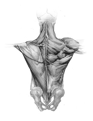
Inside the Artist's Studio: Anatomy (Torso Back) part 3

Here is the final installment of a 6 month cycle of studying and teaching academic anatomy. I feel I have learned a lot about drawing (not just humans) and teaching anatomy. I hope this will make my anatomy classes even stronger the next go round.

I thought this might be a good time to list my favorite books for the academic study of anatomy. Next semester I will be teaching a "Bridgman Studies" class, I will write more about the books I reference when studying the visual side of anatomy at that time. I definitely consider these two different fields of study, and have yet to find a single book that covers both well.


Monday, December 6, 2010

Andrew Loomis

While making a recent purchase on Amazon.com I stumbled across a new listing for Figure Drawing for All It's Worth by Andrew Loomis. About two years ago a listing for Creative Illustration popped up by the same publisher, Titan Books, sadly this never came to be so don't get too excited. Still, This is a staple in the library of the figurative artist, so it can't hurt to pre-order.

Saturday, December 4, 2010

Alla Prima Friday (on Saturday)

Actually I did paint this on Fri, I just didn't get around to shooting it until this morning
2-3 hrs 9 x 12 oil on canvas panel.